The final project for my Illustrator 1 class at UNLV was a branding exercise for a fictitious company of our choosing. Deliverables included a logo, style guide, business card, website hero section mockup, and graphic tee.
THE “CLIENT”
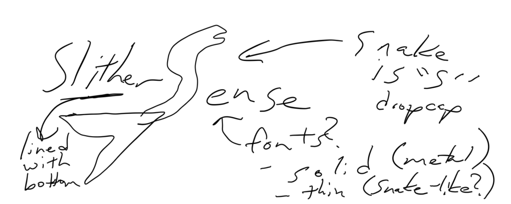
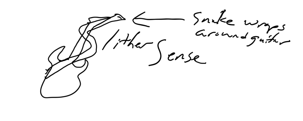
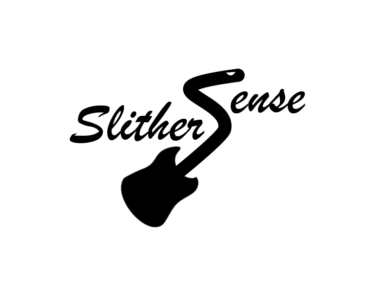
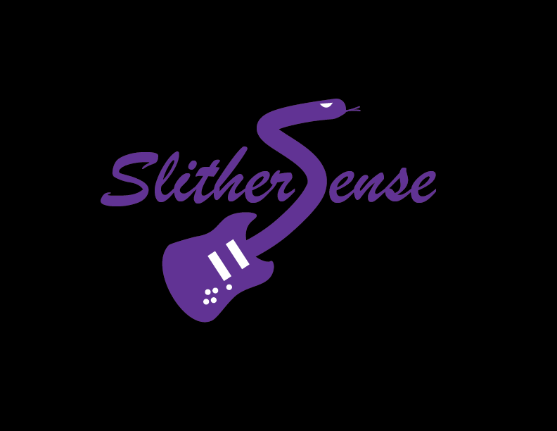
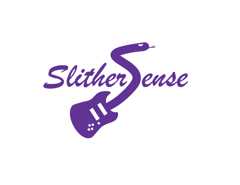
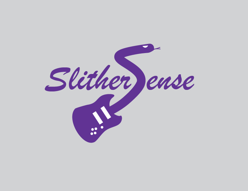
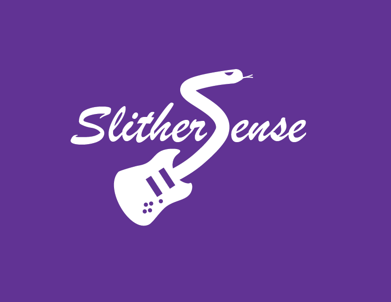
The fictitious company I created was called Slithersense, a company that matches snakes with hair metal bands for use in their music videos – because why should Alice Cooper have the monopoly on snakes! Hence the guitar and snake imagery throughout the project.
The Process...
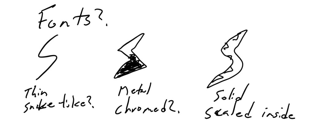
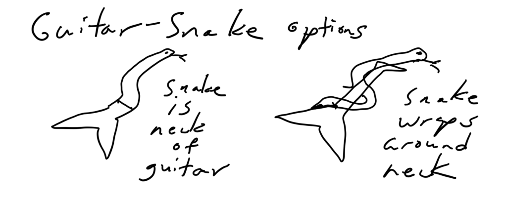
Step 1 – Rough Sketches (selections)
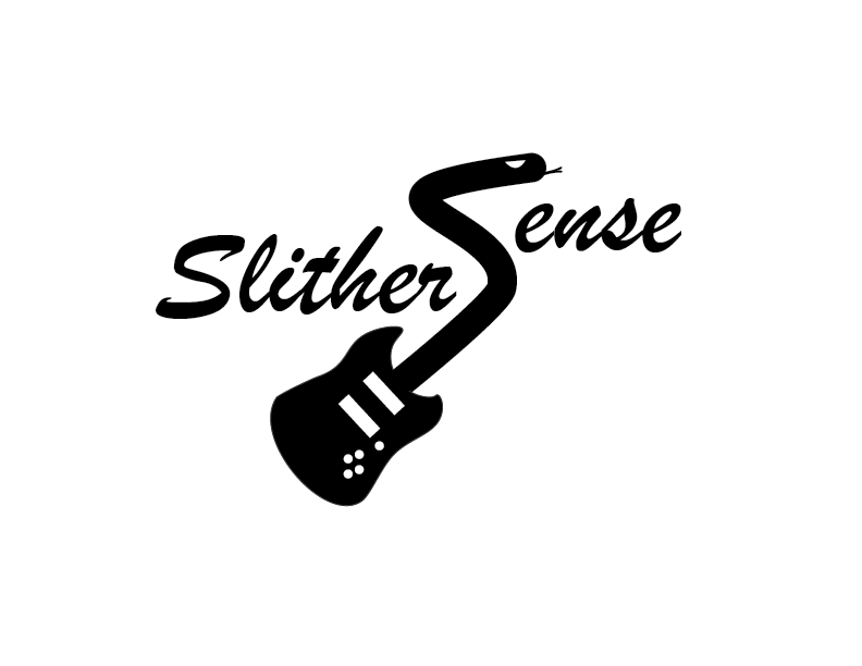
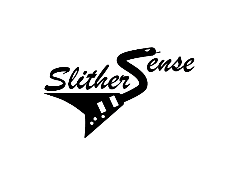
Step 2 – Digital Roughs
These were presented to a friend who acted as a mock client for this assignment. She was given the option to either select a particular design, or mix and match elements she liked from a combination of the designs. I had to adjust subsequent drafts based strictly on her feedback.
My mock client is a fellow metalhead. Hence, she made an ideal mock client, as she would be familiar with the vibe and look that a company such as Slithersense would want.
The Deliverables...
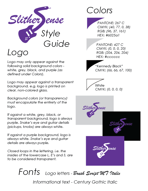
The Logo – against various backgrounds, in compliance with the style guide (below).
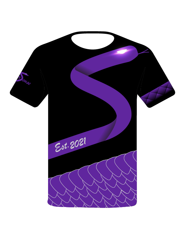
Graphic Tee (Front)
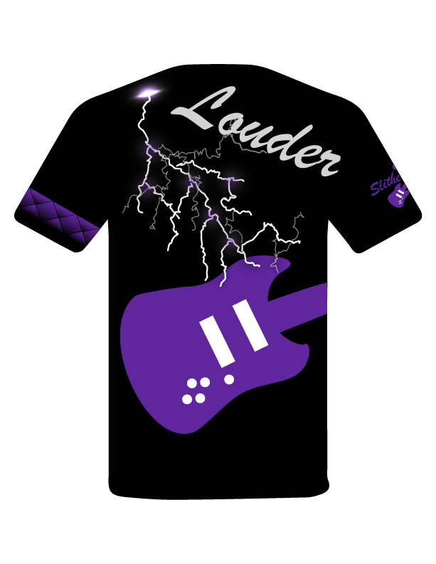
Graphic Tee (Back)
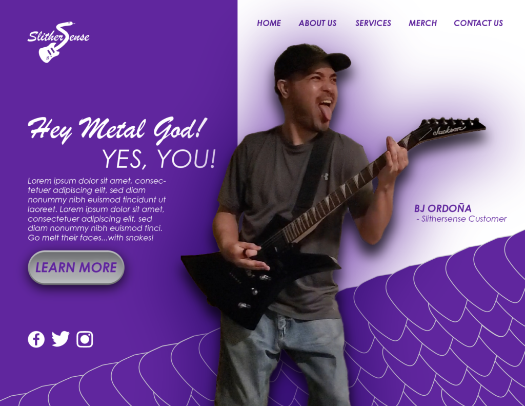
Website Hero Section Mockup
Yes, I actually posed for the photo.
I experimented with various snake scale designs. Then it dawned on me that if I line up rows of guitar pick shapes, they resemble snake scales.