I’ve been a magician for a number of years. (I go by The Great Freakin’ Beejini.) I established my unique look and performing style, but never had any branding to go along with it.
THE IDEA
For my UNLV Print Design Capstone project, we were tasked with designing brand identity for either a real or fictitious company of our choosing. I took this opportunity to create my branding.
The Official Logo
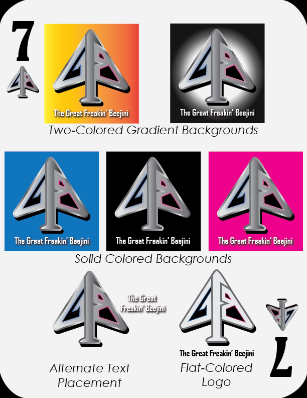
Flat Design – for printing methods that can’t accept gradients, e.g. embroidery.
“Classical” Design
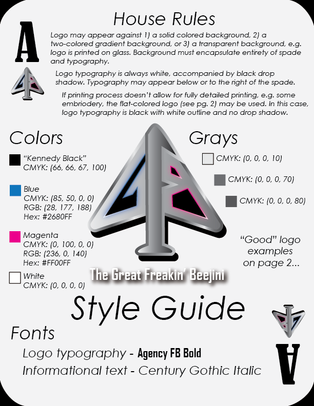
The Logo
My official logo is inspired by David Blaine’s “split spade” design. It’s brilliant how his initials are carved into a spade. I wanted something similar with the initials GFB. I created two versions: one, with a classical look; the other, more modern. I ultimately opted for the latter.
The Style Guide
Since the logo is a spade, the style guide is designed to look like playing cards.
In Practice....
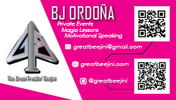
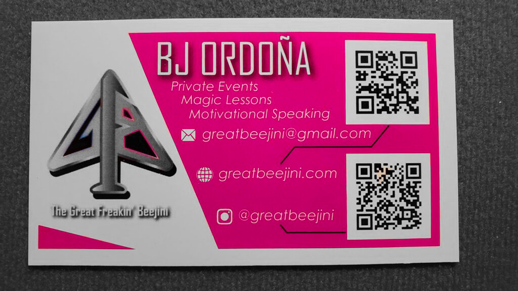
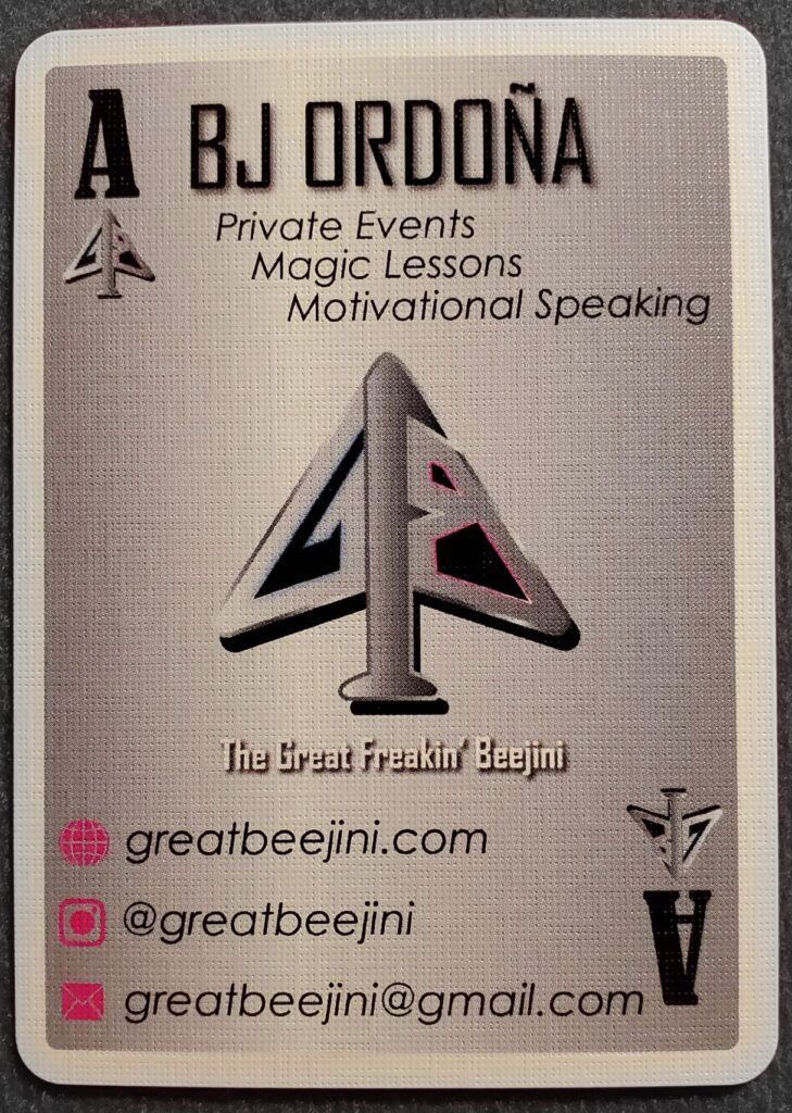
My standard size business card – On top is the original artwork. I modified the final draft to include a white border all around in order to facilitate a magic trick that I perform with my cards. Along those lines, I had them printed on high-gloss card stock. The slickness makes sleight-of-hand possible.
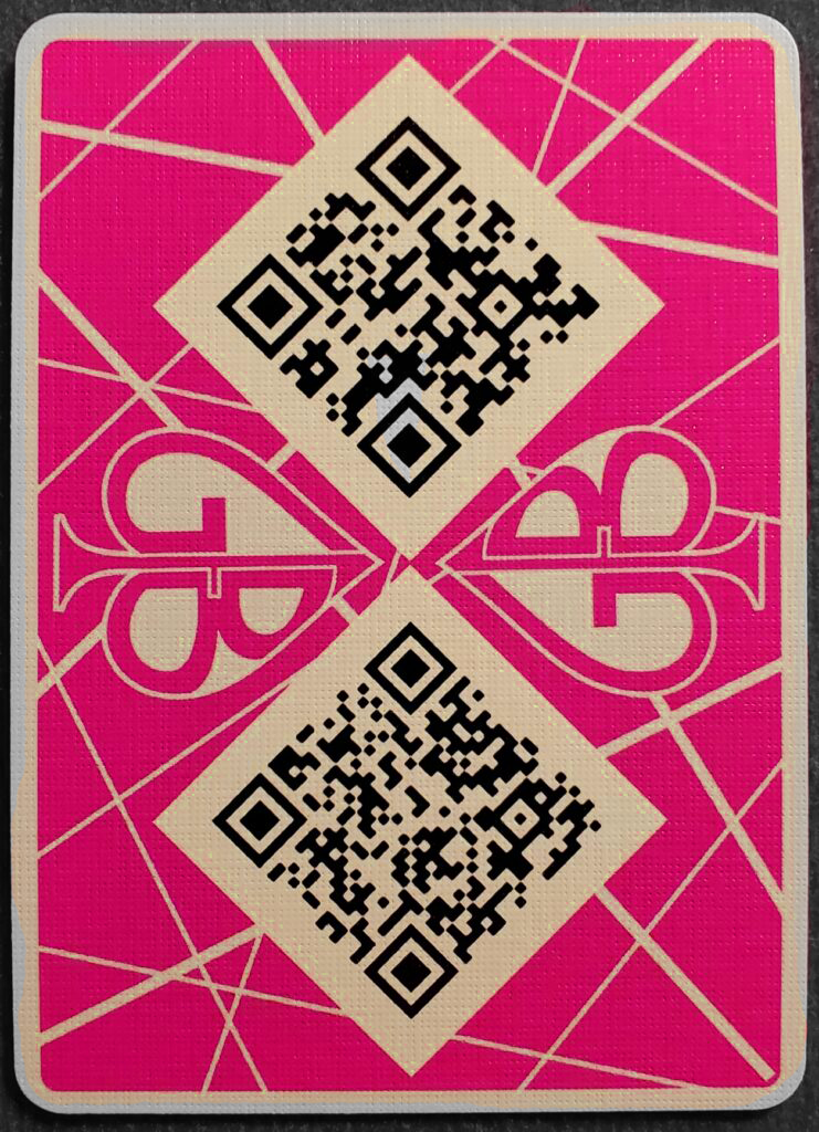
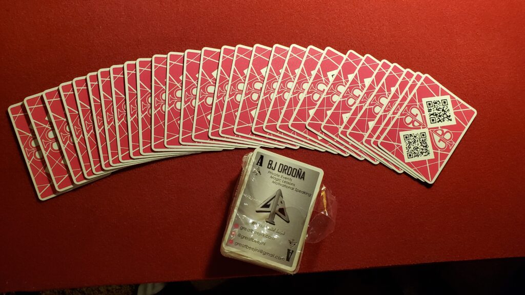
The alternate version of my business card is designed to be a playing card. As I perform magic with them as well, they were printed on makeplayingcards.com’s M31 “casino quality” linen card stock. The back design is inspired by the Van Halen stripe pattern. Also, instead of discarding the “classical” logo, I found an aesthetically pleasing home for it here.